
Made in America (NJ)
for your Wall Decor
Handcrafted Picture Frames

That high-shine, glossy paper you think makes your photos pop might be the very thing that hides them behind a wall of glare. We get it. Standing in front of a wall of printing options feels overwhelming, especially when you've invested time and care into capturing a perfect moment. You worry about choosing a finish that creates distracting reflections, you're not sure which paper will resist fading for years to come, and terms like 'Satin' and 'Luster' sound almost identical.
That uncertainty ends today. This guide provides the clear, professional advice you need to master the world of photo paper finishes. We promise you’ll walk away knowing exactly how to select a surface that makes your images look stunning and last a lifetime behind glass. We'll compare the key characteristics of glossy, matte, and luster side-by-side, explain their archival properties, and show you how to pair them perfectly with your frame to create a handmade masterpiece for your wall.
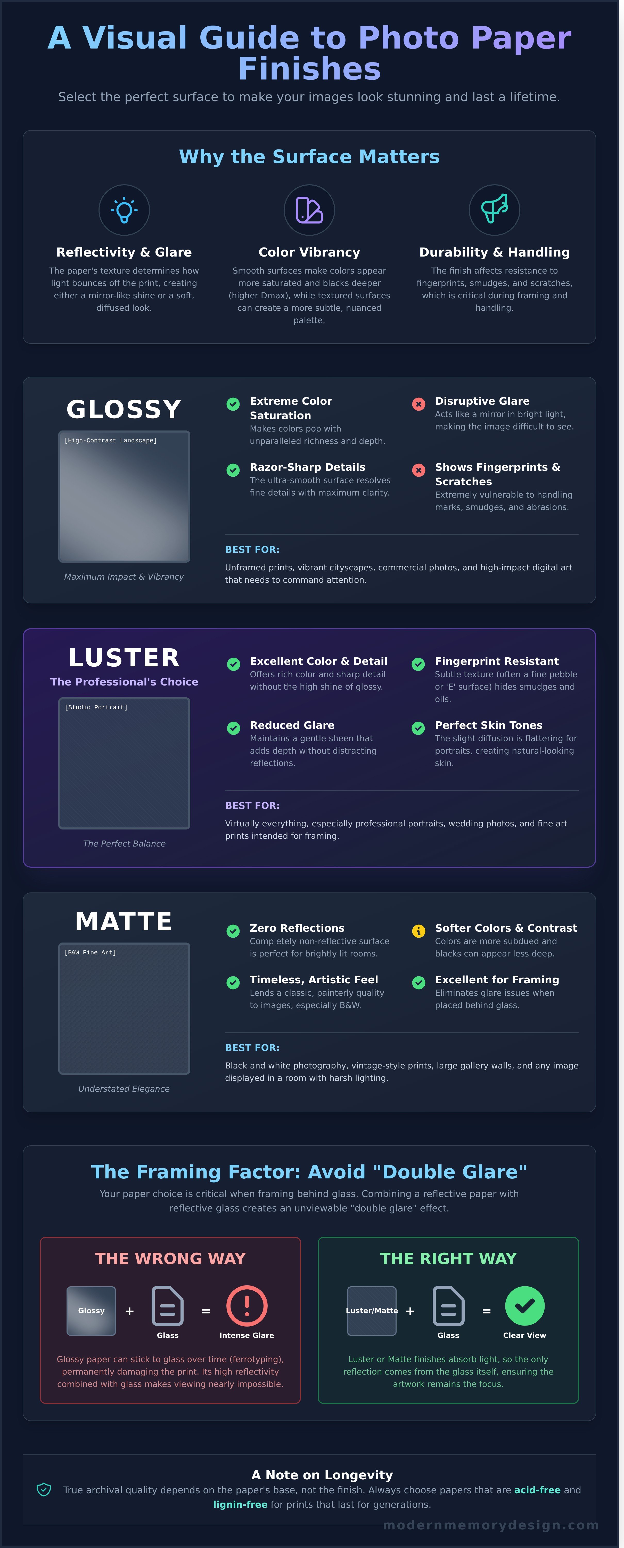
Choosing the right paper for your photograph is as crucial as the framing itself. More than just a simple choice between shiny or not, photo paper finishes are sophisticated chemical coatings engineered to control how a print interacts with light and absorbs ink. This surface determines the final look and feel of your artwork, transforming a digital file into a tangible masterpiece. The decision hinges on three core dimensions: reflectivity (the amount of glare), texture (the physical feel), and color vibrancy (the perceived depth and saturation).
The wrong selection can compromise even the sharpest, highest-resolution image. A high-gloss paper, while brilliant, can produce a blinding glare under direct light, making the image impossible to view. Conversely, a deep matte finish can absorb too much light, causing rich, dark tones to appear muted or 'muddy'. Your choice must complement both the image content and its final display environment to achieve a professional, museum-quality result.
While the surface finish is critical for visual appeal, the archival quality of your print is determined by the paper's core composition. The upcoming 2026 ISO 18902 standard for archival prints emphasizes that an acid-free and lignin-free base is the single most important factor for long-term preservation, even more so than the finish itself. This means both premium glossy and matte papers can last for generations, provided they are built on a high-quality, archival-grade base.
The visual difference between finishes comes down to physics. A high-gloss paper has an incredibly smooth, non-porous surface that causes specular reflection; light bounces off it at a direct, uniform angle, much like a mirror. This creates sharp details and vibrant colors. In contrast, matte and lustre papers have microscopic textures that create diffuse reflection, scattering light in multiple directions. The interplay of these properties is fundamental to understanding photo paper finishes and their practical applications. Dmax, or maximum optical density, measures the deepest black a paper can produce, with glossy finishes typically achieving a higher Dmax for superior contrast and depth.
How a print holds up to handling is a vital consideration, especially during the framing process. Finishes with a texture, like lustre or matte, are significantly more 'touch-friendly' and resistant to fingerprints, as their uneven surfaces hide oils and smudges. A high-gloss surface, however, is extremely vulnerable; it can be permanently marked by scratches and is susceptible to 'silvering'-an abrasion that creates a metallic sheen in dark areas. For this reason, professional framers often prefer finishes with a slight tooth, as they are more forgiving during handling and mounting.
Choosing the right paper for your photograph is as crucial as the framing itself. The finish doesn't just change how a photo looks; it changes how it feels and interacts with its environment. While there are dozens of specialty photo paper finishes available, the decision almost always comes down to three professional-grade options: Glossy, Matte, and Luster. Each has a distinct purpose, and understanding their strengths is the first step toward creating a truly exceptional print.
High-gloss paper is the champion of visual impact. Its ultra-smooth, reflective surface makes colors pop with incredible saturation and renders details with razor-sharp clarity. This finish is perfect for high-contrast images like vibrant cityscapes, dramatic landscapes, or modern digital art that needs to command attention. It's also the standard for everyday 4x6 snapshots for a reason: it makes any photo look bright and lively.
However, that reflective surface is also its biggest weakness. In a room with overhead lighting or large windows, a glossy print can become an unviewable mirror of glare. It's also extremely susceptible to fingerprints and scratches.
Pro Tip: We recommend using a glossy finish only when the print won't be framed behind glass. The high-gloss surface can sometimes adhere to the glazing over time, a process called ferrotyping, which can permanently damage the print.
Matte paper offers a completely different experience. With its non-reflective, soft surface, it absorbs light instead of reflecting it. This makes it the ideal choice for display in brightly lit rooms and for large-format gallery walls where viewers will see the art from many angles. It excels with classic black and white portraiture and vintage-style prints, lending them a timeless, artistic quality.
While matte finishes can make colors appear slightly less vibrant than on glossy paper, they often present a more realistic and nuanced tone, especially in natural light. It's important to distinguish between paper weights. A 'Standard' matte (around 170 gsm) is great for everyday prints, but a 'Fine Art' matte (250-310 gsm) is typically 100% cotton rag and offers true archival quality. Understanding these differences is a core part of professional printing and framing, ensuring your art lasts for generations.
If you're looking for the perfect middle ground, you've found it in Luster. An estimated 90% of professional wedding and portrait photographers choose Luster (often called E-surface) paper. It masterfully splits the difference between glossy's vibrancy and matte's subtlety. Its unique 'pebbled' texture provides a soft sheen that boosts color saturation and detail, retaining about 95% of glossy's color range without the distracting glare.
This fine texture also makes the paper incredibly durable and resistant to fingerprints, making it perfect for photos that will be handled frequently. While often grouped with 'Satin' or 'Semi-Gloss,' Luster is distinct; its texture is generally finer than Satin, providing a more traditional darkroom look. With its balance of brilliant color and practical durability, it's no wonder Luster is our most requested finish for custom framing projects.
Looking ahead, specialty photo paper finishes like Metallic and Pearl are gaining traction for 2026 decor trends, offering a unique iridescent sheen for ultra-modern images and portraits.
Choosing your photo paper is only the first step. The moment a print goes behind glass, a new set of rules applies. The wrong combination of paper and glazing (the glass or acrylic front of a frame) can ruin a beautiful image, while the right pairing creates a masterpiece that lasts for generations. Understanding how these materials interact is crucial for achieving a professional, gallery-quality result in your home.
A common mistake is framing a high-gloss print behind standard glass. This creates a "double glare" effect. The paper's shiny surface reflects light, and the glass surface reflects light, turning your cherished photo into a distracting mirror. An even more damaging issue is the "Newton Ring" phenomenon. When a glossy print presses directly against the glass, it can trap microscopic pockets of air, creating an ugly, rainbow-colored pattern that looks like an oil slick. Over years, high humidity can even cause the print to permanently bond to the glass, destroying the photo.
Many people try to solve the glare problem with non-glare glass, but this often creates a new issue. Standard non-glare glass is acid-etched on one side to diffuse light. While this cuts down on reflection, it also makes the image beneath look fuzzy and slightly out of focus. The crisp, sharp details that define a glossy print are lost. The professional solution is simple: never let the print touch the glass. Expert framers use spacers, hidden strips of archival material that create a tiny, uniform air gap. Current Professional Picture Framers Association (PPFA) guidelines for archival work demand that any material touching the art, including spacers or matting, be 100% acid-free to prevent damage.
Matte and luster finishes are far more forgiving behind glass, but they have their own specific needs. A fine art matte paper has a delicate, absorbent surface that renders deep blacks and subtle tones. To protect these sensitive pigments from fading, pairing it with UV-protective glazing is essential. Standard glass only blocks about 45% of damaging UV rays, while conservation-grade UV acrylic or glass blocks over 98%. For a versatile choice, especially when giving a framed photo as a gift, luster is the safest bet. It offers the rich color saturation of glossy with the fingerprint resistance of matte, making it adaptable to almost any lighting condition. You can find excellent advice for weighing the pros and cons of Glossy vs. Matte vs. Luster for different display environments. Finally, using a matboard not only adds a classic decorative border but also serves the critical function of separating the print from the glazing, preventing any potential 'finish transfer' to the acrylic over time.
To make the best choice for your project, here’s a quick guide to the most common glazing options and how they work with different photo paper finishes:
The perfect print begins long before the frame. The subject of your photograph has a distinct personality, and choosing the right paper finish is the key to letting it shine. Not all photo paper finishes are created equal; a choice that makes a landscape breathtaking can make a portrait feel unnatural. This expert guide breaks down which finish to select for your specific image to achieve professional, gallery-quality results.
Your photo’s content should be the primary driver of your decision. Let’s look at the most common photography styles and their ideal paper pairings.
Your print's finish should complement the room it lives in. For modern or minimalist spaces with clean lines, a High-Gloss or Metallic print in a sleek frame creates a sharp, high-tech focal point. In rustic or traditional homes, the non-reflective surface of a Matte print pairs beautifully with natural wood frames and classic decor. To create a cohesive gallery wall, stick to a single finish like Luster for all your prints to ensure a uniform, professional look.
The light in your room dramatically impacts how a print looks. A glossy print hung opposite a large window will act as a mirror, making the image impossible to see during the day. In brightly lit rooms, choosing a Matte or Luster finish is mandatory to eliminate distracting glare. For corporate settings with harsh fluorescent lighting, a Satin finish is the safest choice, as its low-sheen surface diffuses light evenly from any angle. If your art will be lit by a spotlight, you can use a glossy finish to create a single, dramatic reflection that draws the viewer's eye exactly where you want it.
Choosing the right paper is the first step in creating a masterpiece. Once you've selected the perfect finish for your photo, let our experts complete the vision. Upload your photo and our team will help you select a custom, handmade frame to match.
Choosing between matte and glossy is a critical step, but turning that choice into a tangible, beautiful piece of art is where true craftsmanship comes in. At Modern Memory Design, we bridge the gap between your digital file and a wall-ready masterpiece with our integrated 'Print & Frame' service. We've simplified the process so you can focus on the memory, while we handle the meticulous details of production right here in our Hasbrouck Heights, NJ workshop.
Every photograph we print is a story, and that story deserves to last. That’s why we exclusively use archival-grade papers and inks. Unlike standard consumer papers that can fade or yellow in as little as 5-10 years, our materials are rated to maintain their color and integrity for over 100 years. This commitment to longevity means your most cherished moments won't just look stunning today; they'll become heirlooms for future generations.
The 'Made in USA' difference is at the heart of everything we do. Our expert framers handcraft each frame from premium, American-sourced wood moldings. This hands-on approach allows us to perfectly pair our handcrafted frames with expertly selected photo paper finishes, ensuring a cohesive, professional result every time. For large-format prints, corporate art, or unique custom projects, we invite you to request a professional consultation with our team to bring your vision to life.
We achieve museum-quality results by investing in world-class technology. Our workshop is equipped with Epson and Canon 12-color wide-format printers, renowned for their ability to produce an exceptionally wide color gamut and deep, rich blacks (superior Dmax). This technology, combined with our premium materials, is why customers across NJ, NYC, and CT trust us. Our complete archival package includes:
Bringing your photos to life is a simple, three-step process with our online tool. Just upload your image, select your frame style and size, and choose from our curated photo paper finishes to match your aesthetic. It's a seamless way to design a custom piece from the comfort of your home. We stand by our work with the 'Modern Memory' guarantee; your frame will arrive at your door in perfect condition, ready to hang and enjoy.
Ready to create your masterpiece? Upload your photo and choose your perfect finish here.
Choosing a surface for your print isn't just a final step; it's a defining artistic choice. You've learned how a glossy finish can make colors pop in a family portrait and how a matte surface lends a subtle, glare-free elegance to a fine art landscape. Understanding the key differences between photo paper finishes empowers you to match the paper's unique character to the soul of your image, ensuring the final result is exactly what you envisioned.
The right knowledge is powerful, but expert execution is what creates a masterpiece. At Modern Memory Design, our team of expert NJ framers has been dedicated to this craft since 2014. Every single piece is handmade in the USA, using museum-quality archival materials to protect and preserve your memories. We don't just print photos; we create lasting heirlooms designed to be cherished for a lifetime.
Ready to see the difference professional quality makes? Start Your Custom Print & Frame Project with Modern Memory Design and let our experts guide you. Your most cherished moments deserve to be displayed with care and precision.
Luster is generally better for framing because its semi-gloss surface significantly reduces glare from frame glass. Unlike glossy prints, which can stick to the glass over time in a process called ferrotyping, luster's subtle texture prevents direct contact and potential damage. It offers the rich color saturation of a glossy finish but with the fingerprint resistance of matte, making it the professional standard for high-quality portraits and displayed artwork that needs to look great under any light.
The primary difference between satin and luster is the texture of the paper's surface. Luster photo paper has a more distinct, pebble-like texture that is excellent at hiding fingerprints and reducing glare. Satin, on the other hand, has a much smoother, softer sheen. While both offer a similar level of semi-gloss reflectivity, professional photographers often prefer luster for its durability and traditional feel, while satin provides a more modern and subtle finish for display prints.
No, matte photo paper does not inherently fade faster than glossy. A print's longevity is determined by its archival properties, such as being acid-free, and the type of ink used, not its surface sheen. A gallery-quality matte paper printed with archival pigment inks can last for over 100 years without noticeable fading, which is equivalent to its glossy counterpart. For maximum protection against fading for any print, always use UV-protective glass or acrylic in your frame.
While you can use glossy paper with non-glare glass, it's not recommended for achieving the sharpest image. Non-glare glass has a lightly etched surface designed to scatter light, which can soften the details of the print behind it. When this effect is combined with the highly reflective surface of a glossy photo, the final image can appear slightly blurry or less focused. For best results with non-glare glass, a luster or matte finish is a superior choice.
A metallic photo finish is a high-gloss paper infused with mica crystals that create a pearlescent, almost three-dimensional appearance. This finish makes colors pop with exceptional vibrancy and gives images a sharp, life-like quality. It's an outstanding choice for high-contrast images, vibrant landscapes, automotive photography, or any photo where you want a modern, high-impact look. The metallic sheen is particularly effective at enhancing details in water, metal, and cityscapes at night.
Matte prints can appear less vibrant because your computer screen is backlit, meaning it generates its own light. This light makes colors and whites on screen appear brighter than they are on paper, which only reflects ambient light. Matte paper's non-reflective surface also absorbs more light, which can slightly reduce contrast. To get a closer match, try increasing your photo's brightness by about 10-15% in an editing program before you send it to print.
Both matte and luster finishes are excellent choices for black and white photography, each offering a distinct aesthetic. A true matte finish provides a classic, fine-art feel with zero reflection, emphasizing texture, mood, and subtle tonal transitions. Luster, with its slight sheen, delivers deeper blacks and a wider dynamic range, giving the image a bit more "pop" without the distracting glare of a full glossy paper. The best option depends on the specific mood you want to convey.
To clean a glossy print safely, you should only use a soft, dry, lint-free microfiber cloth. Gently wipe the surface from the center outwards using light pressure to remove dust. For a stubborn fingerprint, you can very lightly dampen a corner of the cloth with distilled water, but never spray liquid directly onto the print. Avoid using paper towels or any chemical cleaners, as their fibers and ingredients can easily cause permanent scratches and damage the photo's surface.
{"one"=>"Select 2 or 3 items to compare", "other"=>"{{ count }} of 3 items selected"}
Leave a comment